Are you looking for modern logo design trends?
Modern logo design, as a profession, is expanding massively. It is on the verge of being one of the most dynamic industries in the future. A logo will become a company’s identity and the most crucial filter in choosing a company. Hence, a logo is essential to create a modern logo design reflecting modern trends. When you begin with the logo it is especially important to understand that a few logo trends are short-lived. In contrast, others are alive for generations to come. Moreover, to survive the heat of competition, originality and relevancy are of utmost importance.
For any individual or a professional, creating a trendy logo should always be a priority. Make sure that your logo fuels your imagination well and has the right concept for your brand identity. Hence, its vital for you to understand what it means to say a modern logo design.
Therefore, in this reading, we have collated a few examples to understand and get real-time motivation to understand the trend better. Happy reading!
What is Modern logo Design?
A modern logo design resembles all the collection of classic and trending elements that creates a fresh and lively benchmark. Modern designs are exemplified by simple fonts, colors, and high defined elements in today’s time. Most of the successful logo shares a lot of characteristics that define a modernization. Studying and examining many modern logo designs helps you understand some of the simple facts about it. Let’s see-
Ease of Understanding
Due to increased competition, customers today have many options and a limited amount to time to choose the right company. Hence, with the change in how customers choose businesses, designing a modern logo design has also changed. The market today demands easily readable and scannable logo designs. The visuals should be simple and straight to the point. Today, the market is open for everyone. One should choose their logo according to their sizes and eventually enhance with time and size.
Using the Gradients
The choices of color and the way it’s used in logos have also changed over time. The use of gradients in modern logo design has brought flatness and materialistic change in the design trend. Gradients are all about using bright colors, boldness, and integration.
Mozilla Firefox is the best example when it comes to using gradients in modern logo designs. It is interesting to design your logo such that people know you by just one specific color. Color themes and a gradient hue is enough to carry out your brand identity is integrated in the right way.
Geometry Shapes
A classic, timeless, and tested combination to create a modern logo design is to use geometric shapes. There are a lot of examples when logos are used in geometric shapes. Using geometry increases the readability, giving viewers an abstract image that scales the interpretation of the image. When added with texts and typefaces suiting it well, a geometric shape can also act as an attention trigger. It serves as a great way to create an attractive logo that looks classy and professional and rewards you in the long term.
If you’re looking at the styling and the best way to boost your image, you can use a simple font and lesser elements in geometry.
Be Vintage
Use of vintage elements in logo design came in picture in 2018. Using history has always been fascinating exclusive of the industry you’re in. People always feel the vicariousness of nostalgia when looking at their past or anything resembling them. Hence, many pro designers use this psychology as their advantage. Using a vintage emblem gives your brand an “old-school” feeling. It can work as a great initiative to build a sense of trust with your audience and comes with a lot of other expertise. Suppose you are a great emphasiser or hold a strong conviction of history. In that case, you can explore the vintage trend to build brand identity.
However, exceptions do exist on this as well. Therefore, if you are involved in the latest innovation and advanced tech, you are strictly advised to stay away from vintage until you know how to put them together.
Text and Icon held side by side
The most recent market trend is a text and Icon placed side by side with each other. Earlier, the Icon and text had a tradition of holding in the overlap that is not used anymore. These days designers are peering text and Icon as two different elements in a logo.
This is done to look at each part of the logo independently and visually, not dependent on each other. Moreover, this also makes a logo simple and easy to understand, saving a lot of time for the viewers.

Some latest trend examples for greater understanding
1.Slack
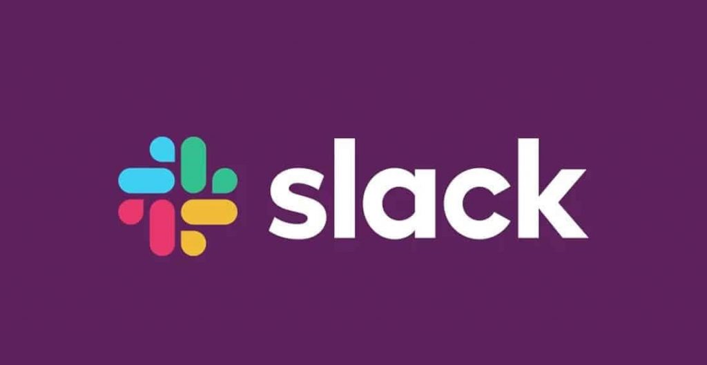
Text and Icon held side by side If you see, the primary element of the above logo is independent of each other. The text is simple and stands just beside the design. This is a great example to understand the versatility of the logo as well.
2.Vintage logo example – The use of historical elements and icons
3. DUKE UNIVERSITY – A pro geometry logo user

4. Mozilla Firefox – Use of Gradient

5.SQUARE UP – Easy to understand

Wrapping Up
Designing a logo is an art and ensures you to be creative. A smart, modern logo design tells your customers that you are exciting and creative. This helps in building credibility and trust among the audience and boosts your revenue. Therefore, it is crucial to invest in logos and get it as perfect as possible.
Good luck!